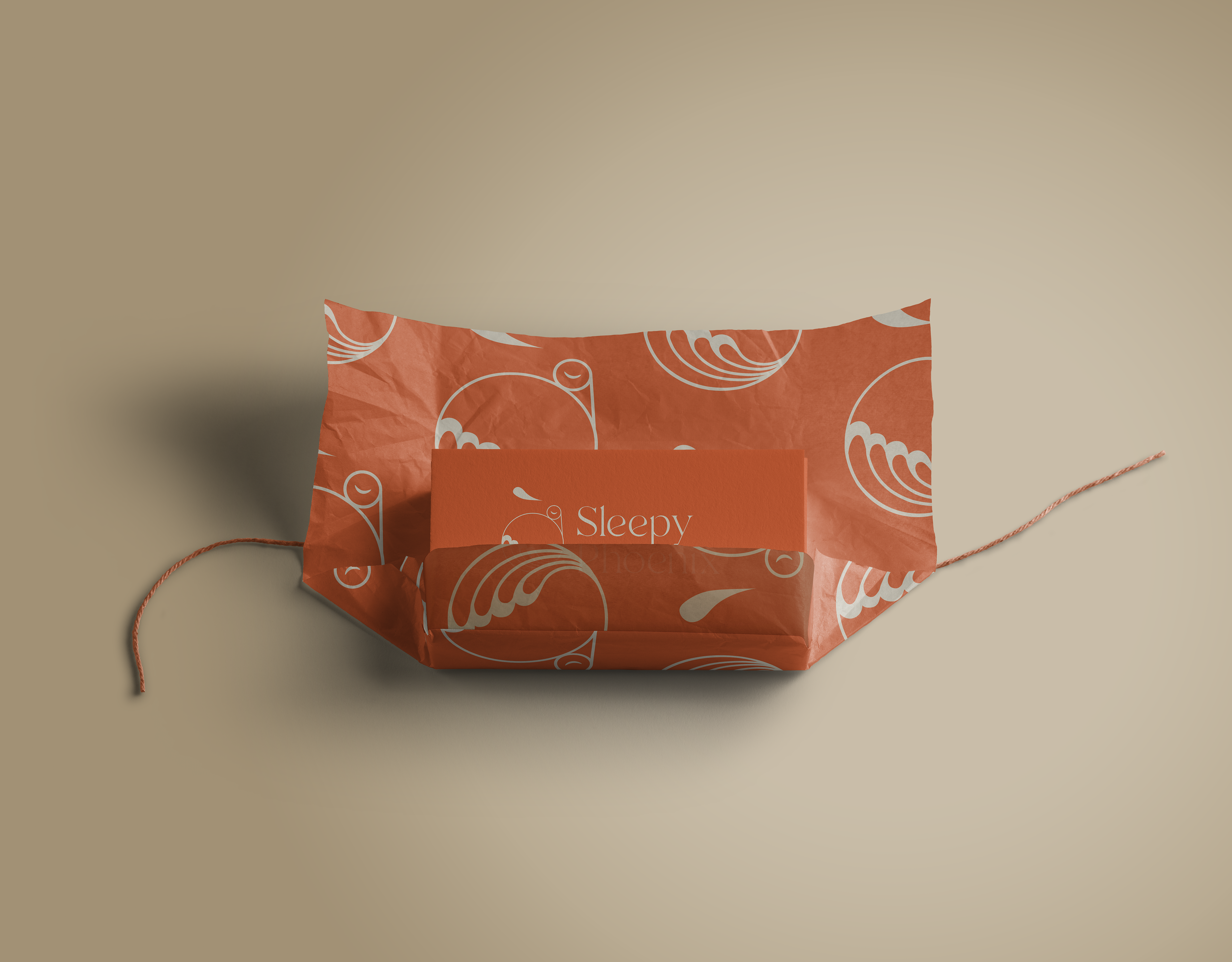
Concept
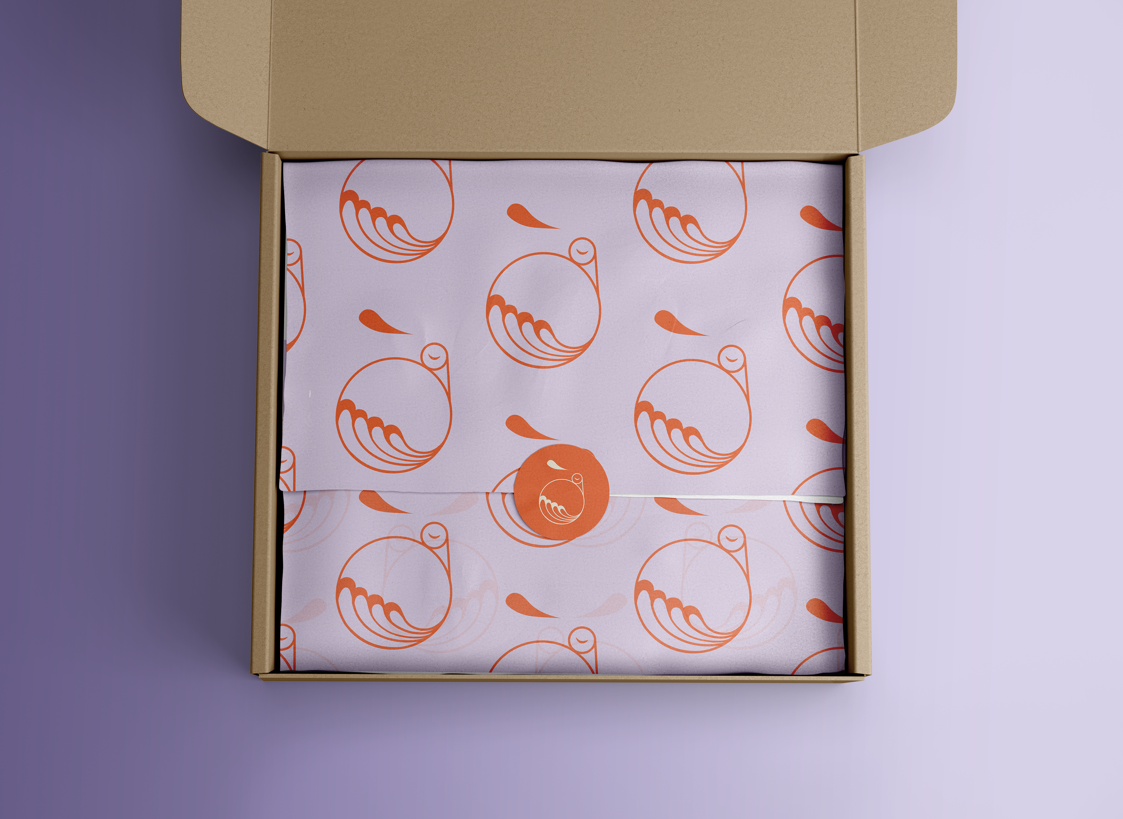
The brand produces handmade cushion covers made of kimono fabrics, an artistic and creative interpretation of precious fabric reuse. The name refers to the symbol and meaning of the phoenix. In Japanese mythology, it is considered a good omen and represents a new era.
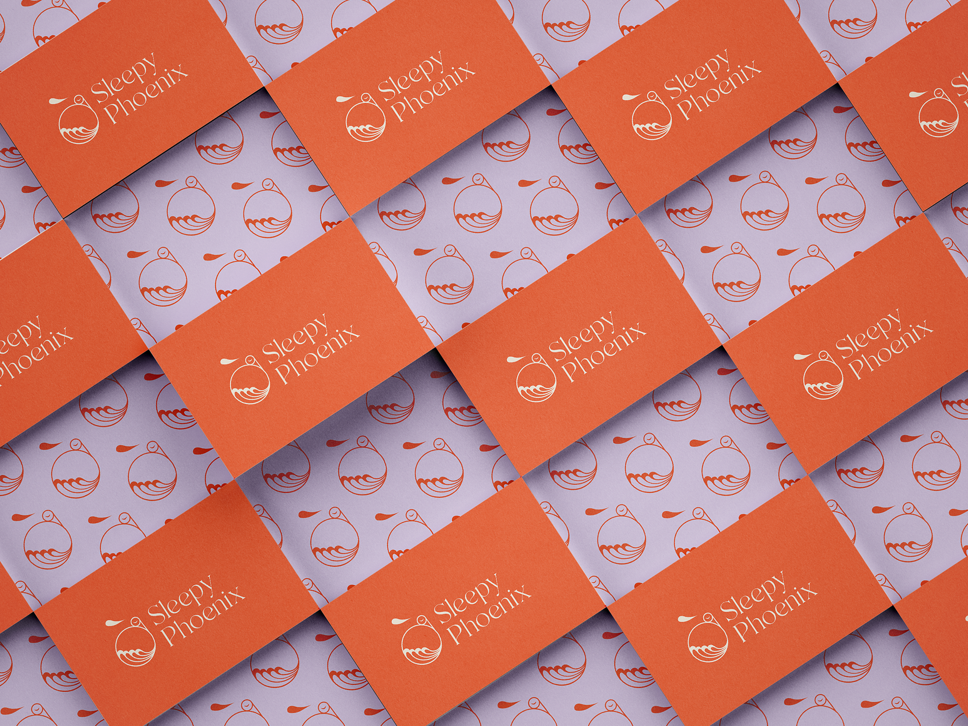
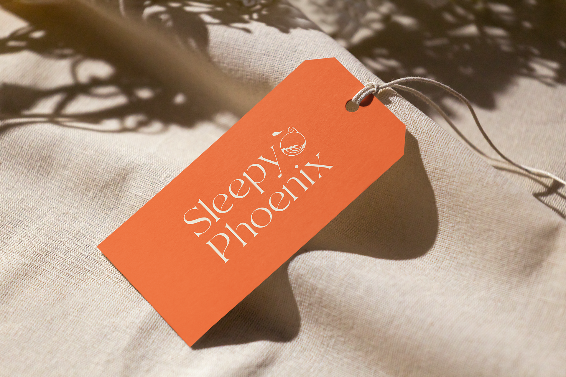
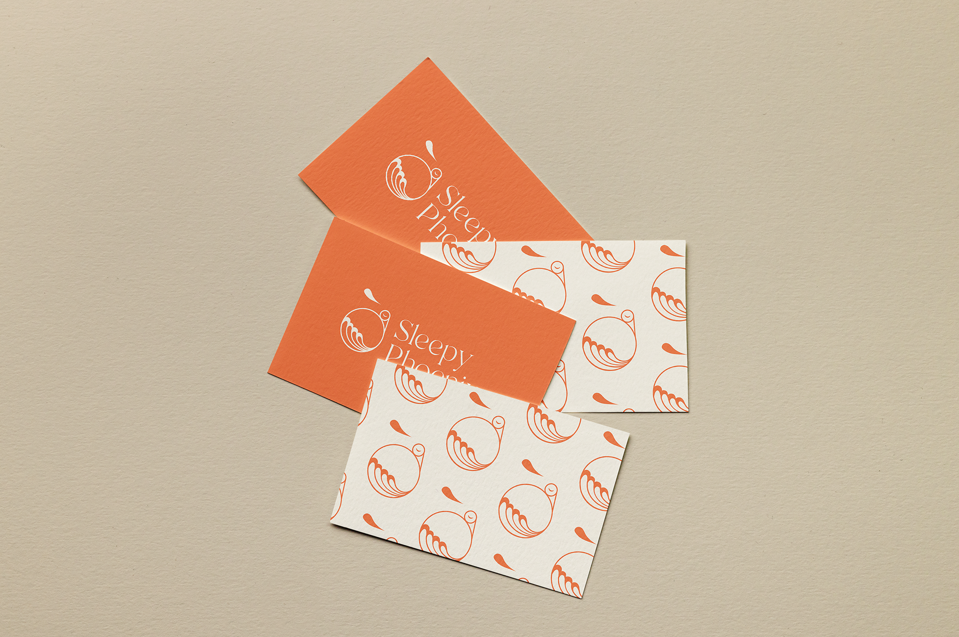
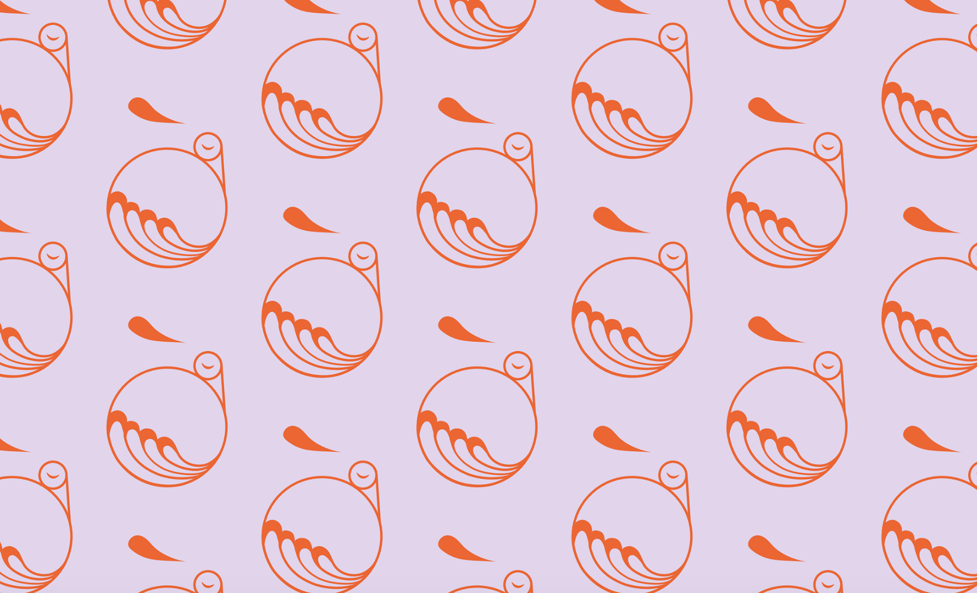
The circular logo depicts a sleeping phoenix with swinging feathers that indicate organic shapes and elements of Japanese silk fabrics. It embodies lightness and elegance. Additionally, the pale, soft, and warm colors represent tranquility and exuberance, a reflection of the brand values.
More information on: https://sleepyphoenix.de
Services
Identity Design, Branding